Top 10 UI/UX Design Tips for OTT Video Streaming Apps

A streaming app does not lose users only because of weak content. It often loses them because the experience between opening the app and pressing play feels slow, confusing, or untrustworthy.
For OTT businesses, UI/UX is not decoration. It is part of the product engine. A clean interface, fast discovery, reliable playback, simple account flows, and strong cross-device continuity can directly influence engagement, watch time, and retention.
In a market where users have multiple subscriptions and limited patience, the best OTT app UI/UX is not the one that looks the flashiest. It is the one that helps users find the right content faster, start watching without friction, and return without thinking too hard.
Foundation
Why UI/UX Matters for OTT Video Streaming Apps
Poor discovery is not a small UX issue; it can become a retention problem. A 2025 streaming discovery report found that 19% of users may abandon a viewing session when their content search fails, and 49% may consider cancelling a service if finding something to watch is difficult.
OTT UX design sits close to revenue because every unnecessary step increases the chance of drop-off. If users struggle to browse, search, resume, subscribe, or manage their account, the app quietly trains them to leave.
Users Form an Opinion About a Streaming App Before the First Video Plays
The first 30 seconds decide whether the app feels premium or unfinished. Users notice loading time, visual clarity, navigation, thumbnails, and the number of steps needed to start watching.
A strong video streaming app UI should answer three questions fast: What can I watch? Why is it relevant to me? How quickly can I start?
OTT Apps Have Different UX Challenges Than Normal Apps
OTT apps are not standard mobile apps with videos added. They operate across mobile, web, tablet, and TV, where screen size, input method, viewing distance, and user behavior change completely.
Smart TV UX is especially different because users sit around 10 feet away and navigate with remotes, not touch gestures. Small text, crowded rows, and weak focus states can break the experience quickly.
Better UI/UX Improves Engagement, Watch Time, and Retention
Retention improves when the app removes friction from repeat viewing. Better recommendations, faster playback, useful rows, reliable resume, and clean subscription flows all help users return.
The goal is not to make the app “beautiful.” The goal is to make watching feel natural, fast, and dependable.
Principles
Core UX Principles Every OTT App Should Follow
Good OTT UX is built around continuity, clarity, speed, and trust. These principles matter more than adding more features.
| UX Principle | Why It Matters | What to Improve |
|---|---|---|
| Consistency | Users switch devices often | Same logic across web, mobile, TV |
| Readability | OTT is often lean-back viewing | Larger text, contrast, spacing |
| Speed | Delay creates frustration | Fast load, fast playback, smooth UI |
| Trust | Billing and privacy affect churn | Clear plans, errors, permissions |
Consistency Across Mobile, TV, Tablet, and Web
Users expect the same platform, not four different products. Watchlists, profiles, resume points, language settings, and subscriptions should remain synced across every device.
The layout can change by device, but the logic should stay familiar. That is how multi-platform streaming design builds confidence.
Accessibility and Readability for Lean-Back Viewing
Readable design is retention design. WCAG guidance highlights accessibility across devices and notes that accessible interfaces often improve usability for everyone, not only users with disabilities.
OTT accessibility should include clear contrast, larger fonts, subtitles, focus states, keyboard/remote support, and reduced clutter.
Speed and Responsiveness Are Part of the UX
Performance is not only a backend topic; users experience it as design quality. If screens lag, thumbnails load late, or playback takes too long, the app feels unreliable.
Streaming UX should be measured from the user’s side: app launch, time to first play, buffering rate, playback errors, and screen responsiveness.
Core Tips
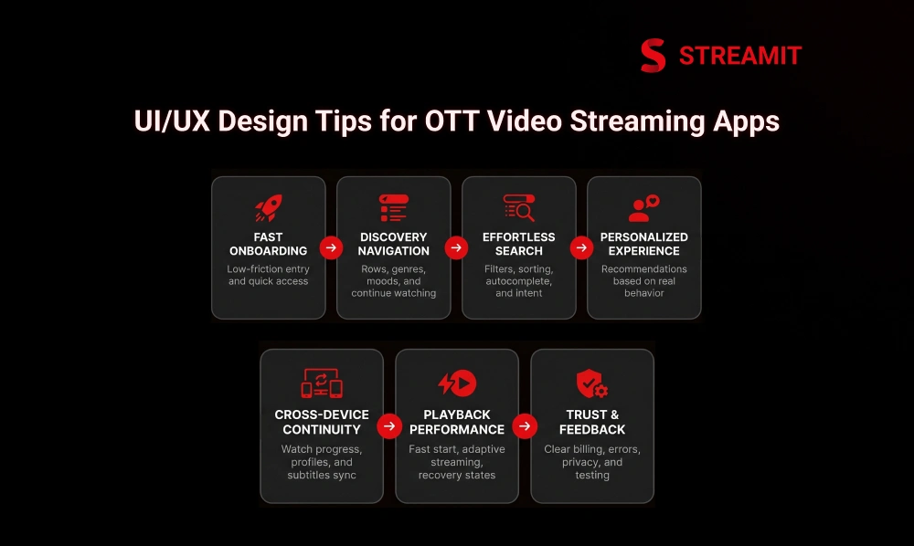
10 UI/UX Design Tips for OTT Video Streaming Apps
The best OTT UI tips are not about adding more screens. They are about removing the moments where users hesitate.
Each tip below connects directly to user movement: open, discover, decide, play, continue, pay, and return.
1. Make Onboarding Fast and Low Friction
Onboarding should not feel like a form-filling exercise. Ask only for what is needed to personalize the first session and let users explore quickly.
Use social login, OTP login, guest preview, profile setup later, and simple plan explanations. The faster users reach content, the better the first impression.
2. Build Navigation Around Content Discovery
Navigation should be built around how people choose content, not how the business stores it. Users think in moods, genres, languages, live content, trending titles, and unfinished shows.
Use clear menu labels, strong content rows, genre shortcuts, watch history, and “continue watching” placement near the top.
3. Make Search, Filters, and Sorting Effortless
Search should reduce effort, not create another browsing problem. Users should find content by title, actor, language, genre, mood, year, or category.
Add typo tolerance, autocomplete, recent searches, filter chips, and result grouping. A good OTT search UX turns intent into playback quickly.
4. Use Personalization to Make the App Feel Relevant
Personalization works best when it feels helpful, not invasive. The app should learn from watch history, skipped titles, completed videos, favorites, and device behavior.
Personalized recommendations, smart rows, and language-based suggestions help users feel the platform understands their taste.
5. Design for Cross-Device Continuity
Users may start on TV, continue on mobile, and finish on tablet. If the experience breaks between devices, the platform feels less mature.
Sync watch progress, downloads, watchlists, subtitles, profiles, and playback history. This small detail has a big impact on daily usage.
6. Prioritize Playback Performance Inside the UX
A video app is judged hardest at the moment of playback. Research on video quality has shown that viewers become more likely to abandon when startup delay crosses around two seconds, with abandonment increasing as delay grows.
Use adaptive streaming, fast start time, preloading where appropriate, clear loading states, and graceful recovery when playback fails.
7. Keep the Interface Clean, Readable, and Accessible
A crowded OTT home screen can make strong content feel invisible. Clean OTT UI means fewer distractions, stronger hierarchy, and better scanning.
Use enough spacing between rows, readable titles, visible buttons, clear focus states, and simple poster layouts. Especially on TV, simplicity beats density.
8. Make Subscription and Account Management Simple
Subscription UX should never feel like a trap. Users should understand plans, pricing, renewals, upgrades, cancellation, and payment status clearly.
Confusing billing flows can damage trust. Recent reporting in India has shown growing concern around dark patterns, difficult cancellations, surprise charges, and unclear subscription design on OTT platforms.
9. Build Trust Through Error Handling, Privacy, and Security Signals
Trust is built when the app explains problems clearly. A generic “something went wrong” message creates frustration.
Show useful errors for payment failures, expired sessions, playback issues, geo-restrictions, and network problems. Also make privacy settings, device management, and logout options easy to find.
10. Improve UX Through Continuous Testing and Product Feedback
OTT UX is never finished after launch. Real usage will show where users search, pause, abandon, cancel, or repeat sessions.
Run usability tests, heatmap reviews, playback monitoring, A/B tests, and support-ticket analysis. Improve the app based on behavior, not internal opinions.
Hidden Friction
Overlooked OTT UX Gaps That Hurt Retention
Many OTT teams optimize the homepage but ignore the small friction points that decide repeat usage. These gaps are not always visible in design reviews.
| UX Gap | User Impact | Better Approach |
|---|---|---|
| Weak search-to-play flow | More drop-offs | Better search, filters, direct play |
| Poor thumbnails | Lower clicks | Test artwork and row placement |
| Broken resume | Lower return rate | Accurate cross-device sync |
Search-to-Play Friction Can Quietly Increase Drop-Off
If users search but do not play, the UX is leaking demand. This is one of the most important OTT UX metrics.
Track how many users search, click, and start playback. Improve suggestions, result order, filters, and empty-state recommendations.
Thumbnails and Content Rows Strongly Influence Viewing Decisions
Thumbnails are not decorative assets; they are decision triggers. Users often choose based on poster image, title clarity, and row context.
Test thumbnail styles, title overlays, row names, and placement. A strong content row can increase discovery without changing the content library.
Cross-Device Resume Experience Has a Bigger Retention Impact Than It Seems
Continue watching is one of the most valuable rows in an OTT app. It helps users return without restarting the discovery process.
Make resume accurate across devices, profiles, and sessions. Avoid showing completed titles repeatedly unless there is a clear reason.
Measurement
UX Metrics Every OTT Team Should Track
A serious OTT product team should measure UX like a business system, not a design opinion. The right metrics show where users lose patience.
| Metric | What It Reveals |
|---|---|
| Time to first play | How quickly users reach content |
| Search-to-play success rate | Discovery quality |
| Continue watching return rate | Repeat engagement |
| Buffering and playback errors | Technical experience |
| Subscription conversion and churn | Revenue friction |
Time to First Play
Time to first play measures the distance between intent and viewing. Lower is usually better.
Track this across devices, networks, regions, and content types. Slow start time can damage even a strong content library.
Search-to-Play Success Rate
Search success is not the number of searches; it is the number of searches that become plays. This metric reveals whether users find what they want.
Improve metadata, filters, autocomplete, spelling tolerance, and result ranking.
Continue Watching Return Rate
Returning users should not have to rediscover what they already chose. Continue watching return rate shows whether resume UX supports habit formation.
Measure how often users come back through this row and complete sessions.
Buffering Rate and Playback Error Rate
Buffering is one of the fastest ways to break user trust. Faster startup, reduced buffering, and consistent quality are linked with stronger engagement and lower abandonment.
Track buffering per device, network, region, CDN, and video format.
Subscription Conversion and Churn Impact
Billing UX has a direct effect on revenue. If users do not understand the plan, they hesitate.
Measure plan-page drop-offs, failed payments, cancellation reasons, refund requests, and support tickets.
Retention
How OTT UI/UX Connects With Retention
Retention is not created by one feature. It is created by repeated low-friction experiences.
A user returns when the app remembers them, loads fast, shows relevant content, plays smoothly, and handles account flows honestly.
Better Discovery Leads to More Viewing Sessions
Discovery is the bridge between library size and actual watch time. A large catalog means little if users cannot find the right title.
Use recommendations, search, categories, rows, and smart sorting to turn browsing into viewing.
Smoother Playback Reduces Frustration and Exit Intent
Playback quality shapes the emotional memory of the app. Users may forgive one bad recommendation, but not repeated buffering.
Design loading states, error recovery, and network adaptation as part of the UX, not as technical afterthoughts.
Cleaner Subscription UX Prevents Avoidable Churn
Some churn happens because users are done with the content. Some churn happens because the product makes billing painful.
Clear plan comparison, simple cancellation, transparent renewals, and easy payment updates help protect trust.
Architecture
What a High-Retention OTT UX Stack Looks Like
A strong OTT experience is layered. Discovery, playback, continuity, and trust must work together.
| UX Layer | Core Elements |
|---|---|
| Discovery Layer | Search, recommendations, smart rows |
| Playback Layer | Adaptive streaming, fast start, recovery |
| Continuity Layer | Profiles, watch history, resume sync |
| Trust Layer | Security, privacy, transparent billing |
Discovery Layer: Search, Recommendations, and Smart Content Rows
The discovery layer decides what users see first. It should make content feel organized, relevant, and easy to choose.
Use personalized rows, trending sections, genre filters, language filters, and contextual recommendations.
Playback Layer: Adaptive Streaming, Error Recovery, and Fast Start Time
The playback layer proves whether the app can deliver on its core promise. Users open a streaming app to watch content, not solve problems.
Build for adaptive bitrate streaming, fast player initialization, CDN readiness, and meaningful error recovery.
Continuity Layer: Multi-Device Sync and Resume Experience
Continuity turns usage into habit. The app should remember progress, devices, profiles, and preferences.
This is especially important for households where multiple users share the same subscription.
Trust Layer: Security, Privacy, and Transparent Subscription Flows
Trust is part of the interface. Users should feel in control of data, devices, billing, and account access.
Make privacy, payment, device logout, and cancellation flows easy to understand.
Platform
Build a Better OTT App Experience With Streamit
Most OTT platforms do not fail because they lack features. They fail because the experience is not built for long-term usage.
Streamit helps streaming businesses build modern OTT platforms across web, mobile, and TV with a stronger foundation for discovery, playback, retention, and growth.
Launch a Modern OTT Experience Across Mobile, Web, and TV
Your OTT app should feel consistent everywhere your viewers watch. Streamit supports multi-device experiences that align design, performance, and user flow.
That means your audience gets a familiar experience across screens, while your business keeps control over the platform.
Improve Discovery, Playback, and Retention With a Stronger UX Foundation
A better OTT experience starts before the first video plays. Search, recommendations, thumbnails, performance, and account flows all need to work together.
Streamit helps teams create a viewing journey that feels clean, fast, and scalable.
Build a Custom OTT Platform That Supports Long-Term Growth
A serious streaming business needs ownership, not a short-term app shortcut. Custom OTT platform development gives more control over UX, monetization, data, and future scaling.
For founders building beyond launch day, this foundation matters.
Summary
Key Takeaways
OTT Growth Is Strong, But Competition Is Sharper
The global OTT market is projected to reach USD 383.52 billion in 2026, so founders need a platform built for retention, performance, and scale – not just launch.
UI/UX Is Not Just a Design Layer
A clean OTT experience directly affects how fast users discover content, start watching, continue across devices, and stay subscribed.
Content Discovery Drives Watch Time
If users cannot quickly find something relevant, they are more likely to drop off before playback even begins. Discovery is a retention lever, not just a search box.
Playback Performance Shapes User Trust
Fast start time, smooth streaming, low buffering, and clear error handling are core parts of OTT UX – not only technical features.
Smart TV UX Needs Special Attention
TV users navigate with remotes from a distance, so readable text, clear focus states, simple rows, and clean navigation matter more than on mobile.
Subscription UX Can Reduce Avoidable Churn
Clear pricing, easy plan changes, transparent renewals, and simple cancellation flows help users feel in control and reduce preventable cancellations.
Final Thoughts
Conclusion
The best streaming app design is quiet, clear, and dependable. It helps users find, watch, resume, and manage everything without forcing them to think too much.
For OTT businesses, good UI/UX is not just about a polished interface. It becomes part of the product infrastructure that supports retention, performance, and long-term trust.
A beautiful app may attract users once, but a reliable experience brings them back. That is where strong OTT design turns into real business growth.
FAQs
Frequently Asked Questions
-
Why do users leave an OTT app before pressing play?
Users usually leave before pressing play because discovery feels slow, search results are weak, onboarding is too long, or the app does not show relevant content quickly enough.
-
How do you reduce search-to-play friction in OTT apps?
Improve search suggestions, filters, content metadata, result ordering, and quick-play routes so users can move from what they want to watch to actual playback with fewer steps.
-
How do thumbnails affect clicks and watch time on OTT platforms?
Thumbnails influence what users notice first and whether they feel curious enough to click. Better artwork, row placement, and title clarity can improve content discovery.
-
What makes smart TV OTT navigation harder than mobile UX?
Smart TV users sit farther away and navigate with a remote. That means larger text, fewer elements, clear focus states, and simple row movement are essential.
-
Why does continue watching break across devices?
It usually breaks because watch progress, profiles, sessions, or backend sync are not handled consistently. A strong continuity layer keeps resume data accurate across devices.
-
Why does buffering still happen even with fast internet?
Buffering can happen because of CDN issues, encoding problems, device limitations, weak adaptive streaming logic, or server-side congestion – not only user internet speed.
-
What should an OTT app show when video playback fails?
It should show a clear reason, retry option, support path, and fallback action. Avoid generic error messages that leave users confused.
-
What OTT UX metrics actually predict churn?
Time to first play, search-to-play success rate, buffering rate, playback errors, continue watching return rate, cancellation reasons, and billing drop-offs are strong churn indicators.